2,800 dietary profiles. Setup had to be the easy part.
Onboarding redesign for Fig - a food safety app serving people who can't afford to get it wrong.
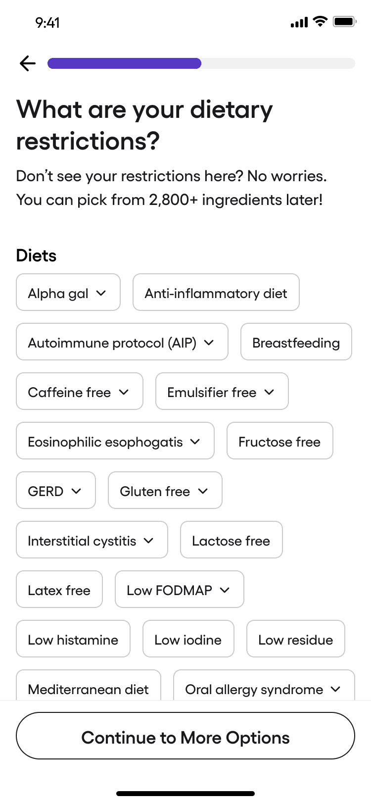
Restrictions
→Ingredients
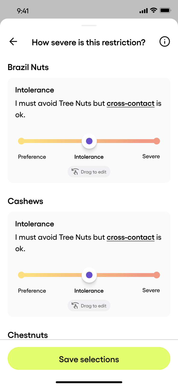
→Severity
→Done
People don't choose dietary restrictions. They live with them.
A mom scanning labels for her kid's peanut allergy. Someone newly diagnosed with Celiac, overwhelmed in the grocery aisle. A person with IBS guessing what won't wreck their day. These aren't preferences. They're survival.
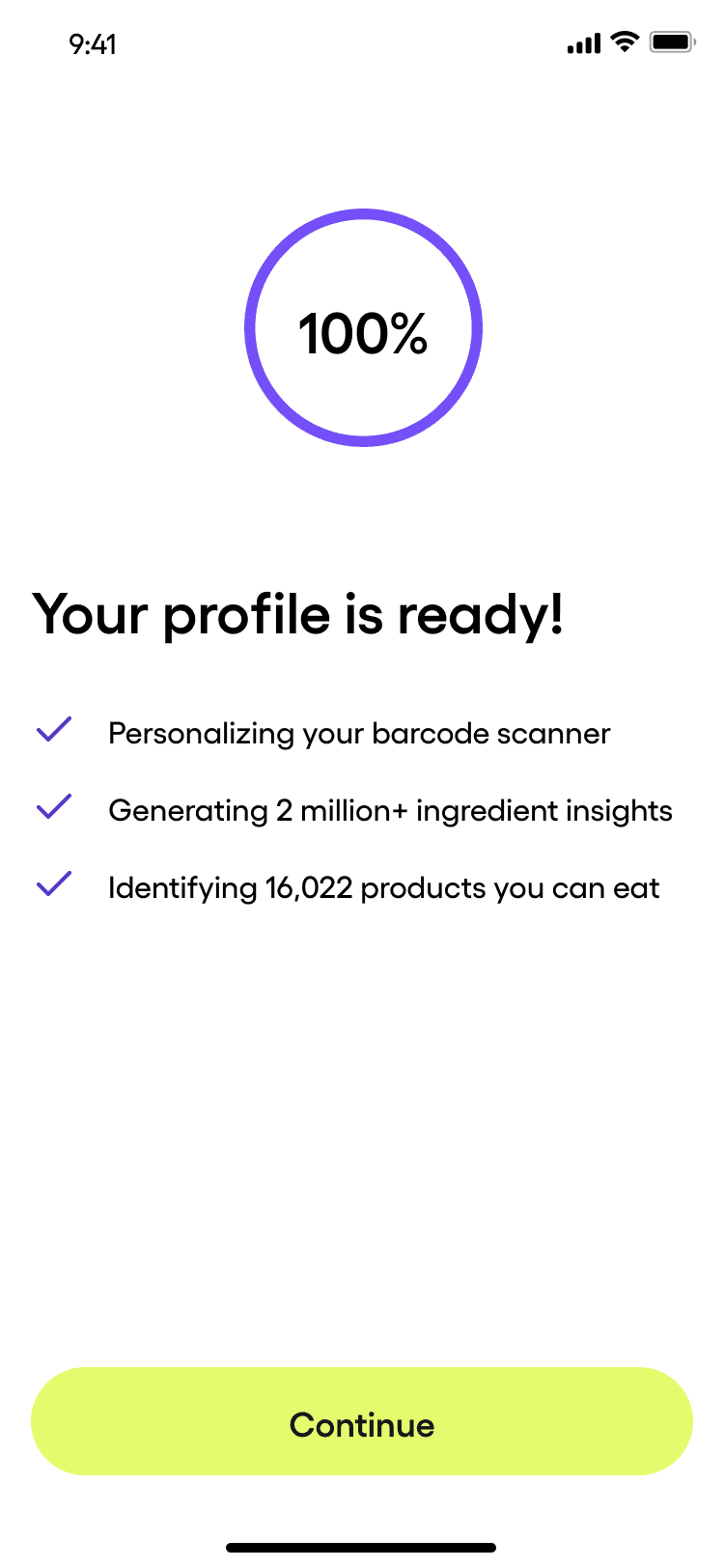
Fig supports over 2,800 unique dietary profiles - 31 medical conditions, every major diet, and ingredient-level avoids like "no Stevia" or "no nightshades." One account holds up to five profiles, because families rarely share the same needs.
People with one restriction got confused. People with ten gave up.
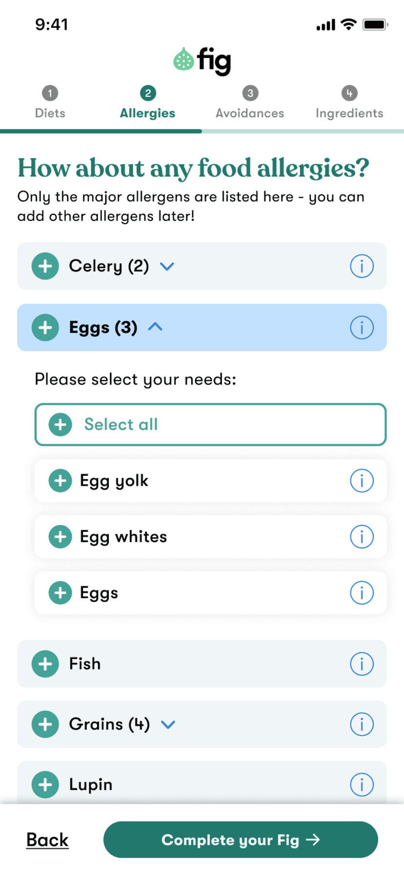
Diets on one screen. Allergies on another. Ingredients tucked away later. Someone with Gluten-Free and a wheat allergy had to hit all three and hope they caught everything.
Before
After
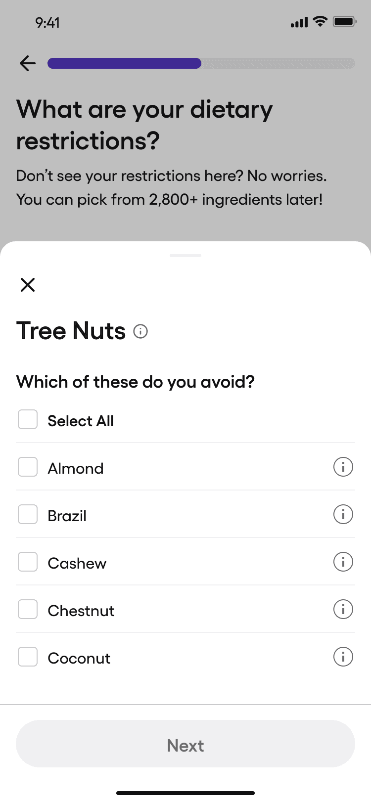
We put it all in one place. Diets, allergies, medical conditions: one screen, searchable. Pick "Eggs"? One tap avoids all. That's enough for most people. Need more control - whites only, not yolks - it's one level deeper. Tap in, adjust, close it, move on. The main screen never explodes. Full customization is there. You just have to choose to go that deep.
Complexity becomes requested, not forced.
I led UX and UI as the sole designer for The Ashley Group, working directly with the Fig team under Herman Sheer's brand system. Designed the consolidated profile creation flow, the sub-ingredient sheet interactions, and multi-Fig visibility in the product detail sheet so families can see at a glance who can - and who can't - eat something.